Visual Identity
1.
Logotype and logomark
2.
Trademark usage
3.
Size and construction
4.
Clearspace
5.
Lockups
6.
Localization
7.
8.
Brand kit
Logotype
The Philosophy
Our primary logo consists of our symbol and wordmark. The symbol consists of our “=” & “F” shape. There are 2 color variants of the primary logo.

Black monochrome

White monochrome
Logomark
The Philosophy
The symbol is the most minimal representation of Frappe.
Use it only in places where the full wordmark “Frappe” is not present or where brand recognition is already established through surrounding context.
As with the primary logo, the symbol is available in two variants to ensure optimal contrast and legibility across any background.


Trademark Usage
The Philosophy
Please Do
Use the mark as an adjective, modifying the Frappe product or service (e.g., “Frappe Framework,” “Frappe Cloud”).
Use the mark consistently and exactly as shown in these guidelines.
Capitalize the first letter of the mark in general text.
Use trademark markings (™ or ®) when feasible.
Say “Frappe is a registered trademark of Frappe Technologies Pvt. Ltd.” when feasible.
Use the most up-to-date version of the mark featured in these guidelines.
Please Don’t
Do not use the mark as a noun or verb.
Do not use the mark in a colloquial or generic manner.
Do not modify or alter the mark.
Do not use the mark in a way that does not refer to Frappe Technologies.
Do not use the mark in possessive form.
Do not use outdated, distorted, or unapproved versions of the mark.
Size and Construction
The Philosophy
The Frappe symbol is designed on a precise geometric grid to ensure consistency and clarity across all sizes. Its proportions stroke thickness, spacing, and corner radius remain fixed, preserving recognizability whether displayed at 16px or 512px.
The core structure consists of uniform 5px strokes subject and 7px cut space., forming a balanced and minimal “F” that scales cleanly across digital interfaces and printed environments.
For optimal legibility, use the recommended icon sizes: 16px, 32px, 64px, 128px, 256px, and 512px. These key sizes ensure that the symbol renders crisply across UI elements, product surfaces, and brand touchpoints.
Always use the official, unaltered artwork to maintain visual integrity at all scales.
Clearspace
The Philosophy
Clearspace defines the minimum area that must remain free around the logo to ensure maximum visibility and distinction in any layout.
Maintaining this buffer prevents visual crowding and helps the Frappe logo stand out across all applications.
For optimal legibility, use the recommended icon sizes: 16px, 32px, 64px, 128px, 256px, and 512px. These key sizes ensure that the symbol renders crisply across UI elements, product surfaces, and brand touchpoints.
Always use the official, unaltered artwork to maintain visual integrity at all scales.
Lockups
The Philosophy
Frappe follows a house-of-brands system where each product is independently named and clearly endorsed by the Frappe master brand.
Logotype
The Frappe wordmark always appears first, followed by the product name. This order must not be changed.
Construction
Maintain a fixed separation of X between the Frappe wordmark and the product name.
Preserve a minimum clearspace of X/2 around the entire lockup.
Align product names optically to the Frappe wordmark for consistent hierarchy.
Usage
Use these lockups for product-specific communications and surfaces.
Always use the approved lockup artwork.
Do not retype, resize, reorder, or alter spacing.
Mark
Product lockups pair the product icon with the product name for use in UI surfaces and product-led communications.
Construction
The product icon sits to the left of the product name.
Maintain a fixed horizontal gap of X / 4 between the icon and the wordmark.
The height of the icon defines the unit X.
Preserve a minimum clearspace of X / 2 on all outer edges of the lockup.
Vertically align the product name to the optical center of the icon.
Usage
Use these lockups for product-specific communications and surfaces.
Always use the approved lockup artwork.
Do not retype, resize, reorder, or alter spacing.
Extended lockups
Product lockups pair the product icon with the product name for use in UI surfaces and product-led communications.
Construction
The product icon sits to the left of the product name.
Maintain a fixed horizontal gap of X / 4 between the icon and the wordmark.
The height of the icon defines the unit X.
Preserve a minimum clearspace of X / 2 on all outer edges of the lockup.
Vertically align the product name to the optical center of the icon.
Usage
Use these lockups for product-specific communications and surfaces.
Always use the approved lockup artwork.
Do not retype, resize, reorder, or alter spacing.
Tagline accommodation
The product tagline is an optional secondary element used to clarify the product’s purpose when additional context is needed.
When included, the tagline should always sit below the product name, aligned to its left edge, and maintain a clear visual hierarchy that keeps the product name dominant.
Spacing & Alignment
Maintain a minimum vertical gap of X/8 between the product name and the tagline.
Keep a horizontal offset of X/4 from the logo symbol to the start of the product name.
The tagline must never exceed the width of the product name.
Size & Hierarchy
The tagline should be set at a smaller scale than the product name to preserve emphasis.
Use regular or medium weight only. Avoid bold or display styles.
Localization
The Philosophy
फ्राप्पे
The Frappe name in Devanagari script can be used in regional communications, partner materials, and contexts where it fits the audience.
Pronounced /ˈfræpeɪ/ (frap-pay).
Logo usage
The Philosophy
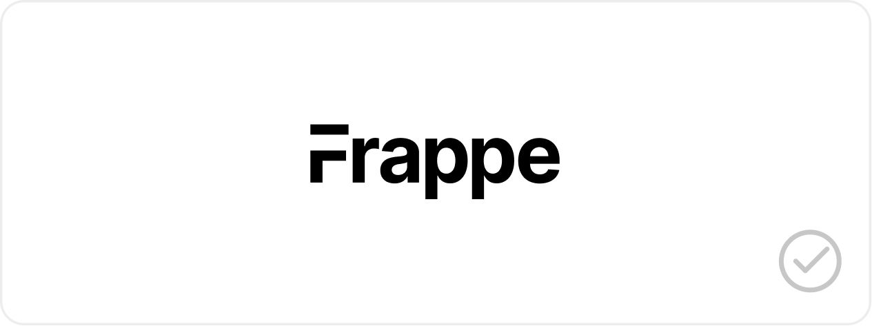
Maintain the original proportions of the logo (10:3). Do not stretch or squash the logo.
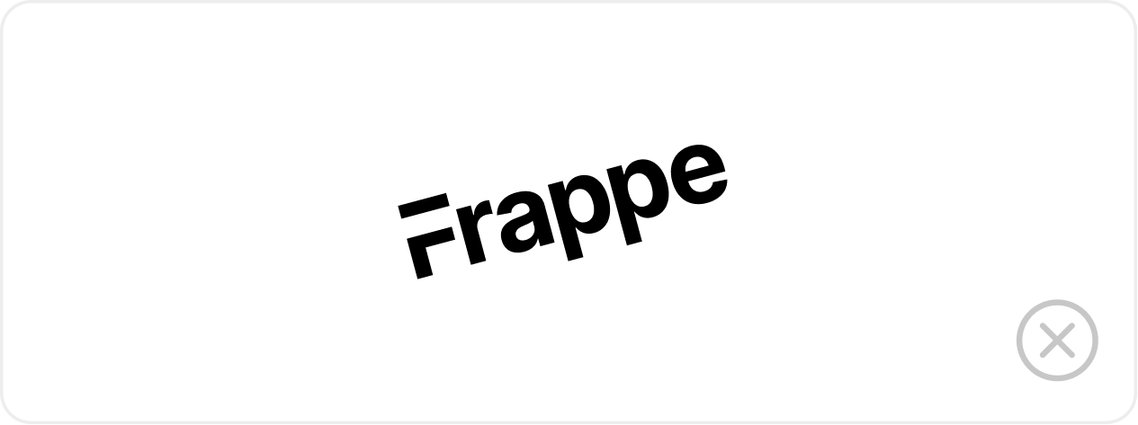
Don't rotate or skew the logo.
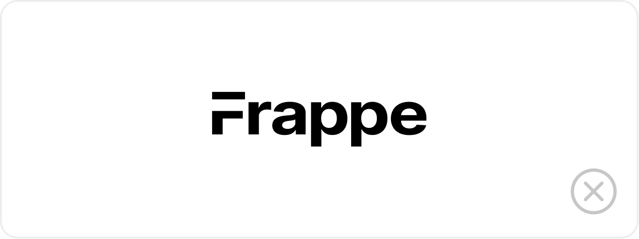
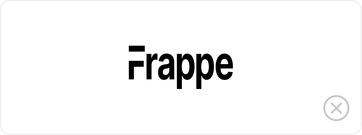
Do not stretch the logo.
Brand kit
The Philosophy
All Frappe and product logos, in one zip. Available in SVG and PNG versions.
“The unexamined life is not worth living”
~ Socrates


