

We got Frappe version 16 before GTA 6! Did you checkout the new features yet?
There was a lot that happened behind the scenes to make this release possible. The team got together for a candid discussion on what went into making this release happen, the challenges we faced, and how we overcame them. Checkout the video, Behind Version 16, to know more.
Table of Contents
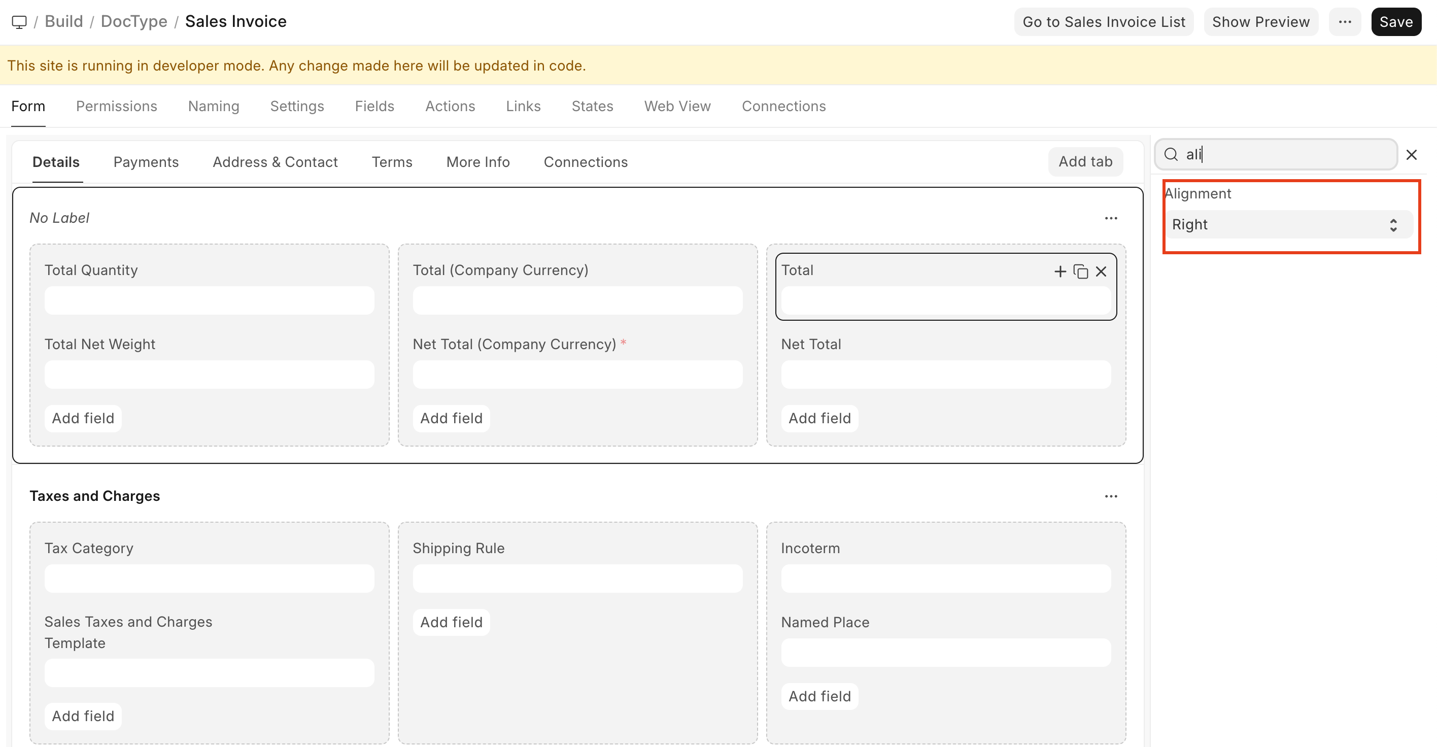
Better Form Layouts with Field Alignment Control (#35933)
You can now control text alignment for supported field types like Data, Int, Float, Currency, and Percent. A new alignment option is available in DocField, Custom Field, and Customize Form, allowing you to set Left, Center, or Right alignment. This works consistently for both editable and read-only fields, improving form readability and layout control.
Contributed by: Avc
f6e0ec.png)
Support for Chrome PDF Generator in Standard Printing (#35812)
You can now choose the PDF generator used for standard print formats. A new PDF Generator setting in Print Settings lets you switch between wkhtmltopdf and Chrome, making it easier to use Chrome-based rendering where better accuracy or compatibility is needed.
Contributed By: Rahul Agrawal
d29d27.png)
A Cleaner, More Actionable Form Sidebar (#35890)
The form sidebar has been redesigned for better clarity and usability. Key actions like Print and Edit Title are now easier to access, the layout has been simplified, and spacing and visual hierarchy have been improved. The updated sidebar adapts better to different contexts while keeping frequently used actions within quick reach.
.png)

Transaction Deletion Record
A tool used to strip all transaction data and leave behind the masters. Used primarily for clearing demo sites or converting a test/demo site for production. It has received major functionality upgrades.
- The new Doctype To Delete list is available, which can be imported/exported in CSV format
- Can also handle custom doctype through the above list
Contributed by: Henning Wendtland
Miscellaneous
- Update Clearance Date button becomes inactive after validation error. Errors are converted to toast to conserve the session.
- Past Due Date has been converted to Grace Period for better readability. Contributed By: Jatin
- The Exchange Gain/Loss journal got incorrectly booked while foreign currency Payments and Reverse payments are reconciled. This has now been fixed. Contributed By: Navin
- Use Submission Queue over queue_action for Journal Entries with over 100 rows. This handles Update After Submit much better. Contributed By: Navin
- New system-wide default ageing range - 30,60,90,120 option now available. Contributed By: Sowmya Arunachalam
- Prevent over-allocation of Advance Paid value if there are multiple partial advance payments. Contributed By: Lakshit Jain

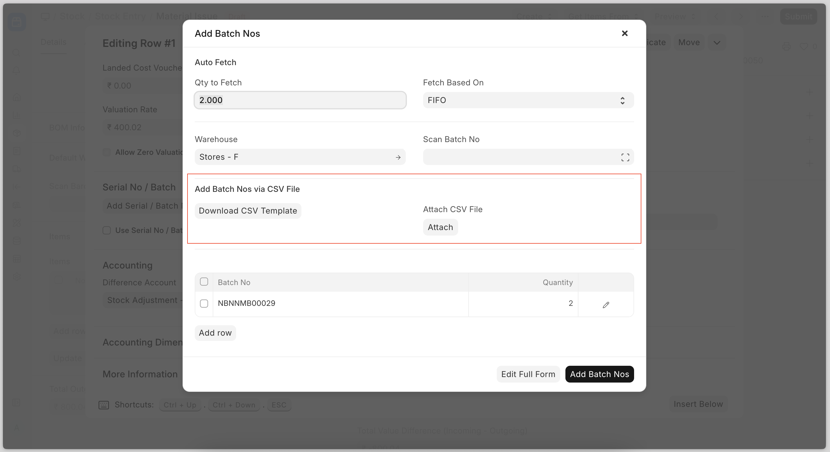
Import Serial and Batch Bundles
Now users can create serial and batch bundles for outward entries by importing a CSV file.
Miscellaneous
- Improved the performance of the stock entry creation with the serial numbers (high quantity)
- Fixed landed cost voucher amount for the internal transfer purchase receipt
- Added a checkbox Set Incoming Rate as Zero for Expired Batch in Selling Settings. When it's enabled, the system will set zero as the valuation rate for stand-alone credit notes with expired batches.

Holiday List Assignment
Introduced in v16, you can now assign holiday lists (yes, plural) to either employees or company.
Why is that important? Glad you asked. Remember the Christmas holidays, you tried to apply for leave across the year, but would consider next year’s weekends as leave days too? That was because at any point, the leave applications could only refer to one holiday list from the employee or company master; now with list assignments, they can refer to last year’s or next year’s assigned holidays as well.
And this applies in other places as well, like bulk marking attendance. To know more, read the documentation.
Miscellaneous
You could disable desk login from system settings; now the PWA honours this setting too. Contributed by: Daniel
Leave encashment amount was exclusively set in salary structures and was the same for all employees who shared a salary structure; now it can also be set in individual salary structure assignments to assign different encashment rates to employees, even if they have the same salary structure. Contributed by: Nareshkanna S
.png)

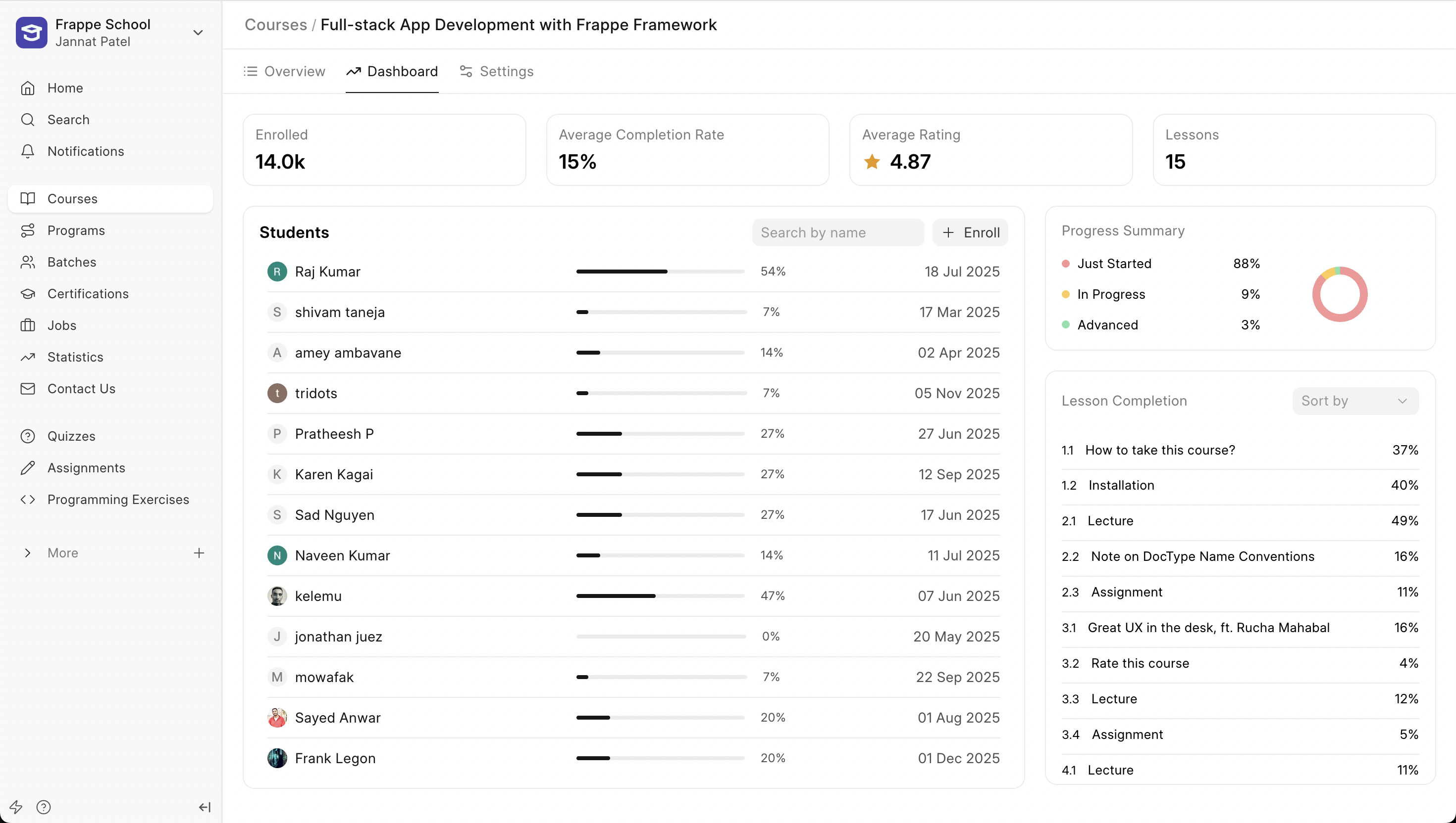
Dashboard for Course Instructors
A new dashboard has been introduced for Course Instructors to track the various metrics of their course. The first section of this dashboard shows them the average progress made by the students, average rating received by the course.
Then, below that, they see a list of students enrolled in the course along with the progress made by them individually. Instructors can now also enroll students in their course directly from here.
Instructors can now also track the completion rate of every lesson in the course. This information will help them understand which lessons are performing well and help them derive trends from these numbers.
Also, Instructors no longer need to click on an Edit button to update their course details. The entire course form now resides in the Settings tab next to the dashboard.
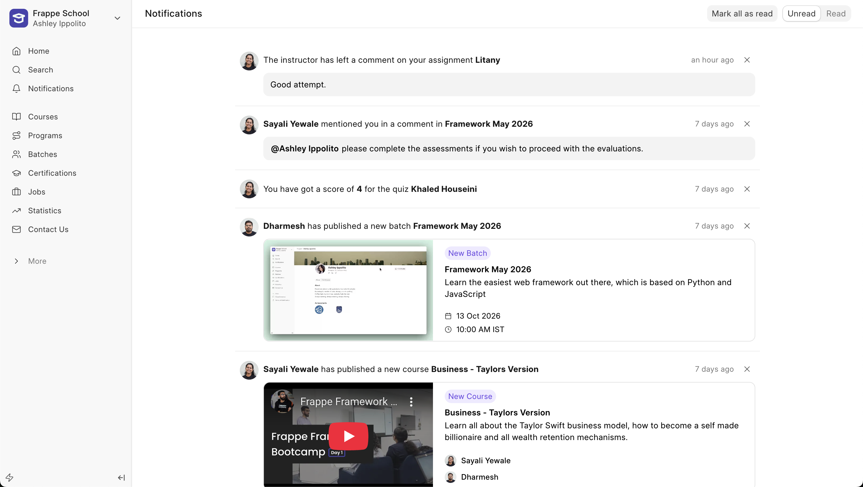
Improved Notifications Feed
Notifications now appear as a feed to keep the users up to date with all the recent activities. With this new feed look, we have enhanced all existing notifications as well as introduced new notifications.
Admins can now configure to send email or in-app notifications for when a course or batch gets published. Along with this previously, when a user was mentioned in a message, users would now be able to see the message in the notification itself, without having to redirect to the batch or course.
Also, now when an instructor leaves a comment on the student's assignment, they will see the comment directly in their feed.
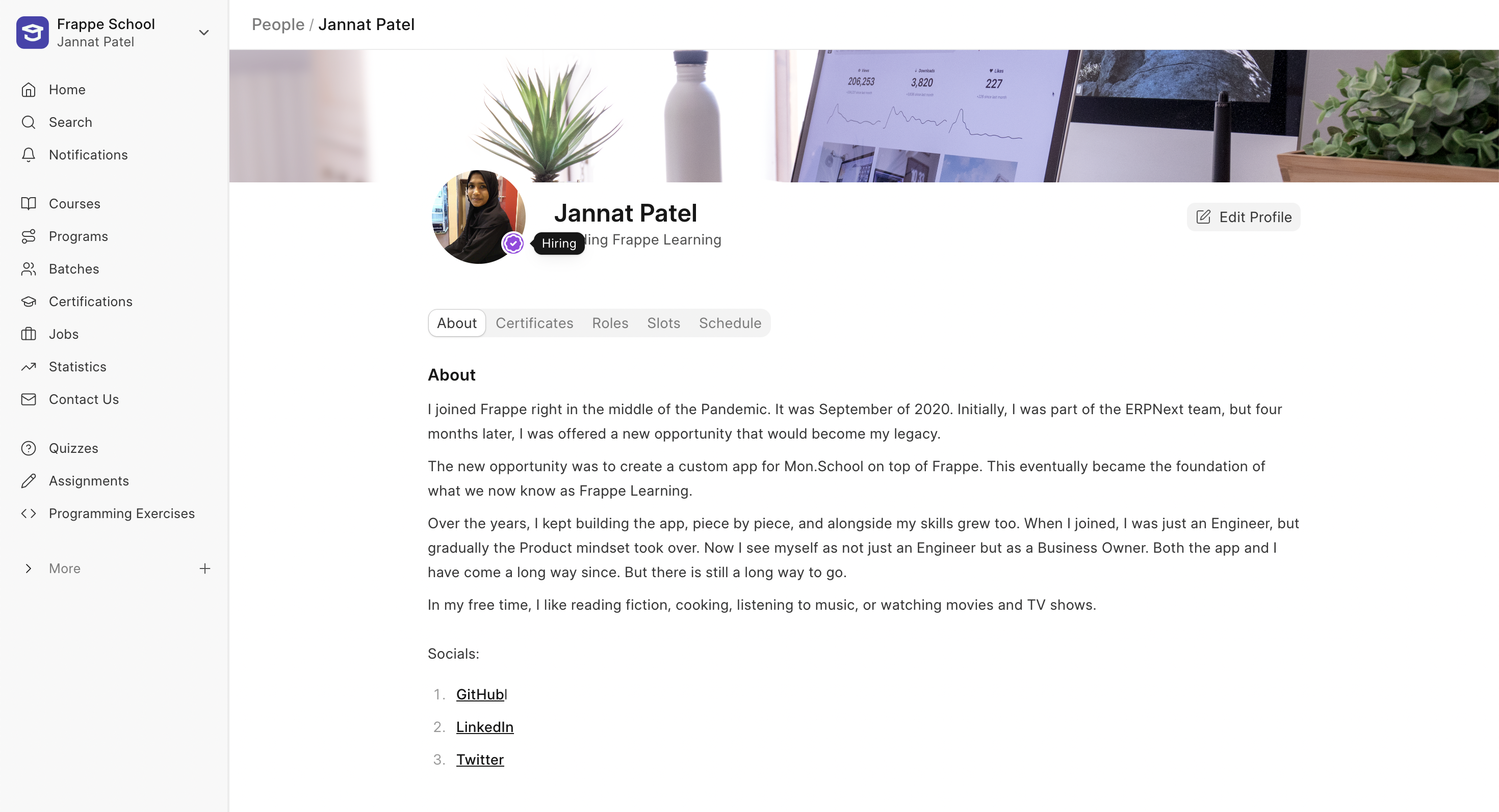
Open to Hiring
Last month, we introduced the Open to Work indicator for people looking for work. This month, we have introduced the Open to Hiring indicator. People who are hiring can enable this from their profile page and add relevant links in their profile bio. This way, job seekers can identify them by the indicator and reach out to move things forward.

New Custom Measure Editor (WIP #741)
Previously, the measure editor did not have any code validation, so if there was any error, you still had to confirm your formula and wait for the server to throw error messages.
Now the code editor will pre-validate your syntax and suggest hints if there are any errors in your code. You’ll also see a list of functions with documentation and columns, so you don’t have to change your screen if you’re stuck somewhere.
.png)
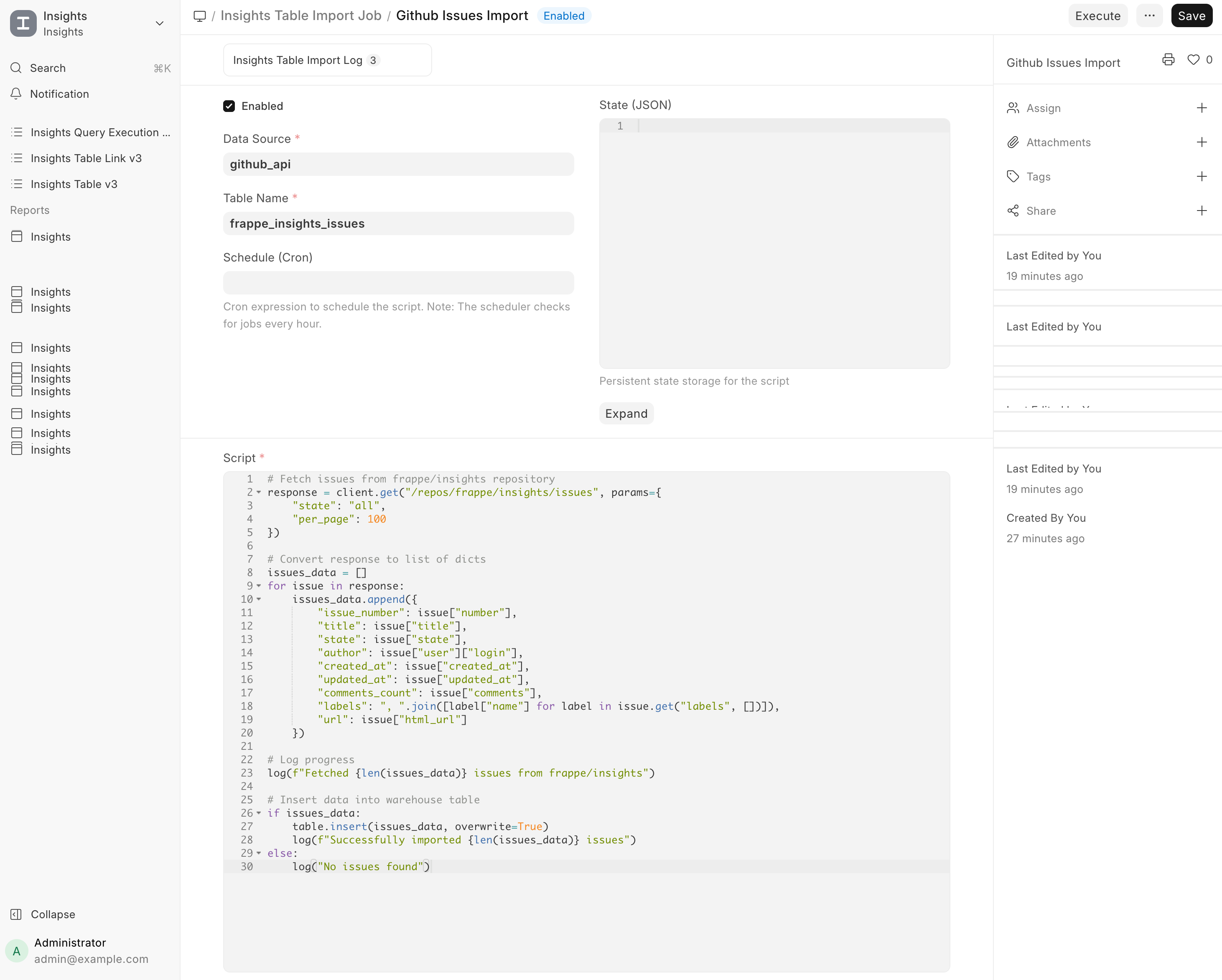
Table Import Jobs for API Data (#757)
Features
- API Data Sources: Data sources can now represent REST APIs, with support for Bearer Token and Basic Auth
- Table Import Jobs: Scheduled jobs that run user-defined Python scripts to import API data into the warehouse
- Incremental State: Jobs can persist state between runs (e.g., last synced ID or timestamp)
- Secret Management: API keys and tokens can be stored & accessed per job
How It Works
- Create an API data source with endpoint details and credentials
- Create a Table Import Job and provide a Python script
- Configure a schedule (e.g. 0 */6 * * *)
Enable the job
Miscellaneous
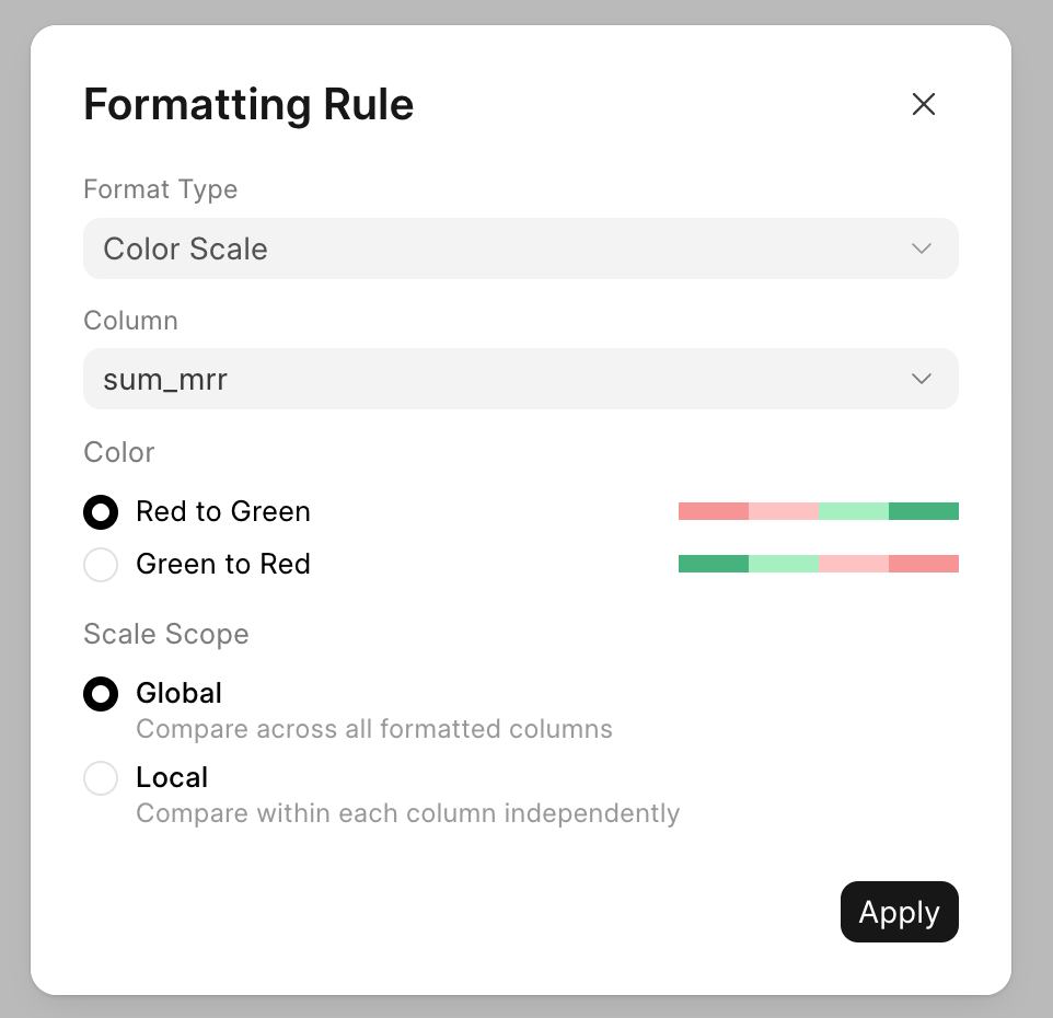
You can add color scales to a pivot table with options to choose from global and local color scales (#750)
- Search for Unresolved Locations on map (#747)
- Bookmark Dashboards (#748)
- Icons for dashboard filters (#640)
- Include Custom Fields when checking child table permissions (#756)

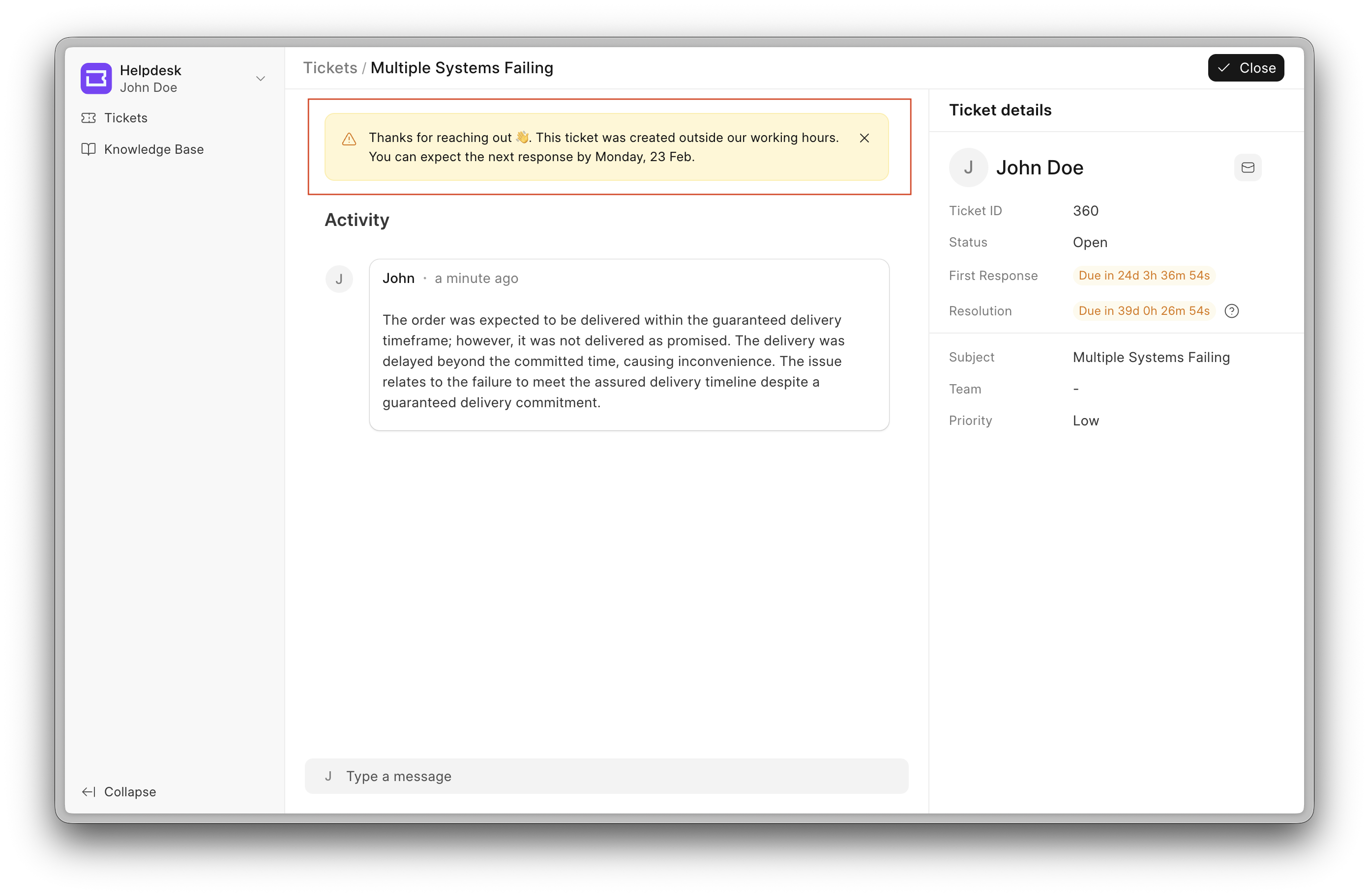
Outside Working Hours Banner (#2902)
The Outside Working Hours Banner is a new Helpdesk feature designed to set clear expectations when tickets are raised outside regular working hours.
When users submit a ticket outside working hours, response times may be delayed. To avoid confusion, this banner proactively informs users about the potential delay in resolution.
How it works
- The banner can be enabled from the General section inside Settings.
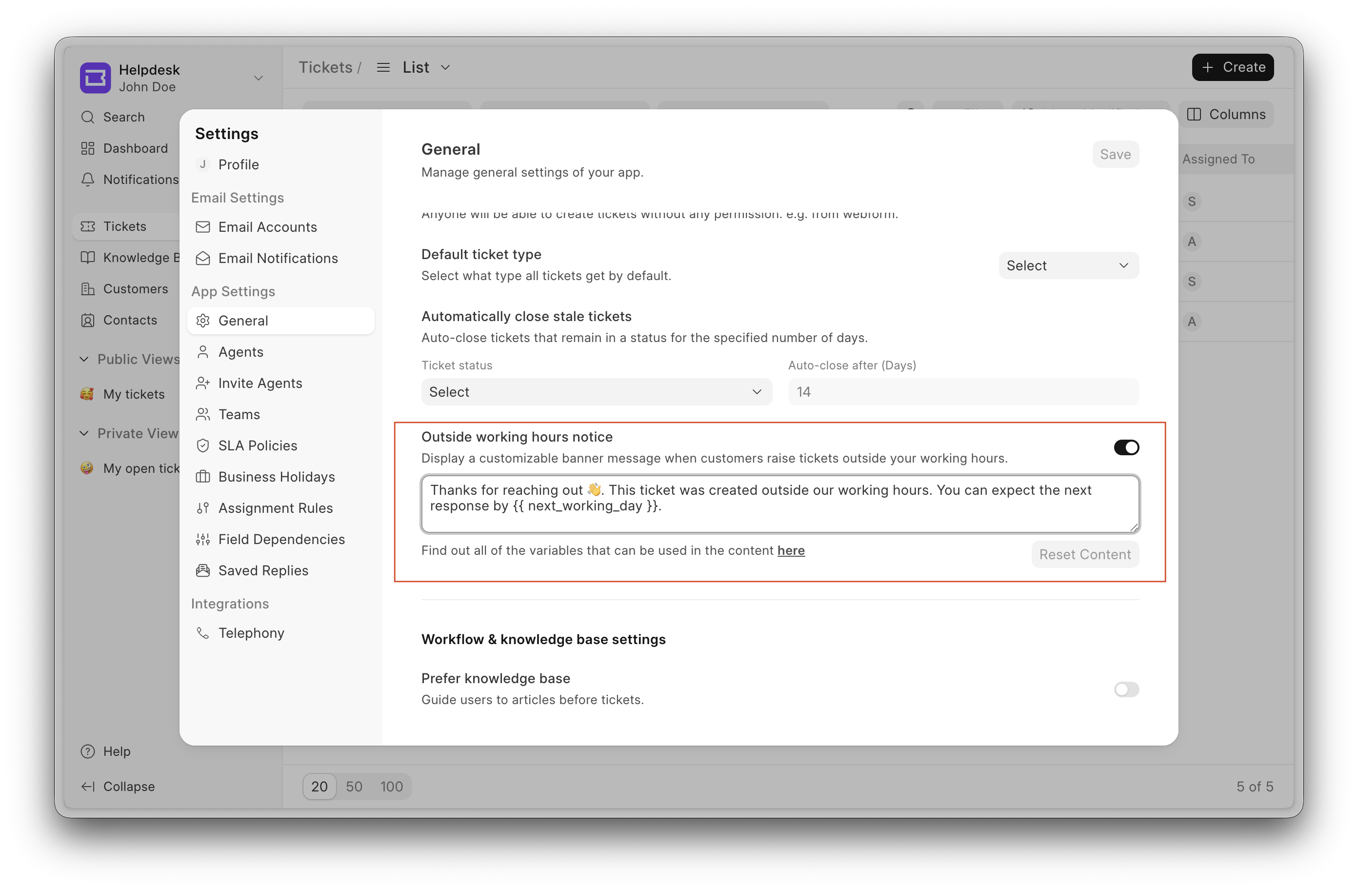
- Once enabled, it appears when a ticket is raised outside the working hours defined by the SLA.
- The system intelligently determines whether to show the banner based on:
- SLA working hours
- Public holiday
Display logic
Inside working hours → No banner
Outside working hours → Banner is shown
If a ticket is raised outside working hours and viewed after the working hours for that day, the banner will be displayed. Once working hours resume, the banner will no longer appear.
Additionally, if an agent replies to a ticket that was raised outside working hours, the banner will no longer be shown, even if it is still outside working hours.
The banner is dismissible. Once dismissed, it remains hidden for the rest of the day.
Comment Reactions on Ticket
We continued improving the ticket view to make it more powerful, and this month we’ve introduced reactions for comments.
With this feature, agents can react to comments posted by other agents, reducing the need for acknowledgement replies and keeping conversations concise by replacing short comments with reactions.
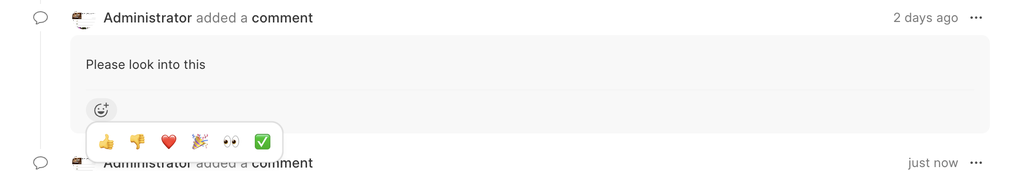
Once an agent reacts to a comment, the author of the comment receives a notification. Contributed by: Samarth
.png)

Bringing doctypes to the CRM frontend - WIP (#1524)
This month, I started working on a larger initiative: bringing doctypes to the CRM frontend. This is a foundational change and will take time, but the goal is to make the portal more flexible, consistent, and closer to how doctypes work across the product.
Where I started
The first step was to dynamically render routes for each doctype instead of handling them manually. Once routing was in place, I focused on getting the List View working, since it’s the primary way users interact with records.
For now, the standard sidebar items are hardcoded, but the groundwork for customization is already laid.
What’s implemented so far
- Dynamic routing
- Routes are automatically generated for all non-single and non-table doctypes.
- Standard routes like
/doctypework out of the box.
- Dynamic List Page
- Each doctype now has a dynamic list page with auto-generated routes.
- The list supports:
- Filtering
- Sorting
- Column selection & resizing
URL-based filters
- Filters can be passed directly via the URL.
- Example: This makes it easier to share filtered views or link to specific datasets.
/doctype?name=["LIKE","%A%"]
Custom Views
- Custom Views are fully implemented.
- Supported routes:
- Standard list:
/doctype - View-based list:
/doctype/view/viewName - View with filters:
/doctype/view/viewName?name=["LIKE","%A%"]
- Standard list:
- Users can:
- Create new views
- Edit existing views
- Duplicate views
- Pin views
- Make views public
- Delete views
Sidebar groundwork
- While the sidebar items are currently hardcoded, the structure is ready for moving this to a UI Customization doctype so it can be managed dynamically later.
What’s next
This is just the beginning. The current work focuses on laying a solid base with routing, list rendering, and views. In the coming iterations, I’ll continue expanding this to make the portal more configurable, reduce hardcoded behaviour, and bring it closer to a full doctype-driven experience.
UI Improvements - (#1603)
Better empty states
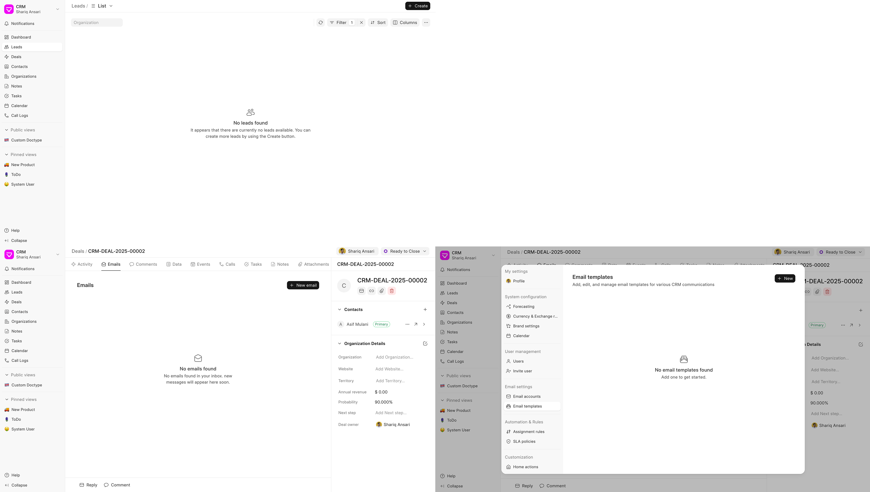
Sidebar with better sections
.png)

Standard Pages (#405)
Developers can now export pages built with Frappe Builder to their custom apps so that on installing their app, users will get some app-specific web pages out of the box, which users can customise later.

The usage is very simple, just
- Create a complete web page in developer mode
- Toggle the Standard Page option from page settings
- Select the app you want to export your page to
Once this is done, all the files required to recreate your page will be exported to the builder_files & builder_assets folder of selected app.
Dark Mode Image Support (#464)
You can now set separate images for light and dark mode in Frappe Builder.
This makes it easy to ensure images stay readable and visually correct in both light and dark mode, without hacks or duplicate blocks.
https://drive.frappe.io/drive/f/cjuj76i456/darkimage-mp4
Better drag-n-drop experience in the Layers panel (#467)
We’ve added drop target indicators so you can clearly see where a block will be placed before dropping it, especially useful when nesting blocks. We also removed the ghost element that was getting in the way during drag. This makes working with deeply nested layouts much smoother and more predictable.

Debounced and Deep options in Watcher (#150)
A watcher in Studio is used to watch any variable and run a script whenever the variable changes. However, the control over when the script should run was limited. Added a few options for control:
- Deep: Watch nested properties of an object source
- Debounced: To configure debounce on the function execution. eg: user input is stored in a variable, and you are running a script as the user input changes. But you don’t want to run it on every keystroke. Configure debounce to reduce your function calls
- Changed the label for immediate config as the previous one was confusing. What does immediately mean?: Run Immediately? > Run on page load
.png)
Style panel improvements (#151)
Building UIs in Studio is component-driven. Previously, when adding custom elements, containers, or text blocks, users would often select random colors from a picker or set shadows and borders manually. This led to inconsistencies where custom styles failed to match the predefined component library.
To ensure visual consistency, I have integrated Espresso tokens into the relevant style properties: backgroundColor, borderColor, boxShadow, borderRadius, textColor, fontSize, fontWeight, lineHeight, and letterSpacing. Implementing these tokens also provides the necessary foundation for future dark mode support.
Color pickers (#151)
 (1).png)
Other Tokens
| Border Radius | Shadow |
|---|---|
 (3).png) |
 (4).png) |
TextBox Changes
Before: TextBlock component had props for fontWeight, lineHeight, and textColor, which were mapped as classes to the component.
Now: Removed these props and moved them to styles since they are used for styling
Typography tokens
Still keeping fontSize as a prop for class since it’s a combination of line height, line spacing, and size
Others
- Added Search in the component properties panel
- Maximize the button in the props code editor to open it in a modal
- Added new properties in the Style Panel
- order (for flex)
- cursor
- Allow unsetting the overflow property
- Rearranged Right Panel: Props & Style panels now combine for TextBlock & Container because they are used a lot on the canvas and have no props (container)/very few props (2 props in TextBlock)
.png)
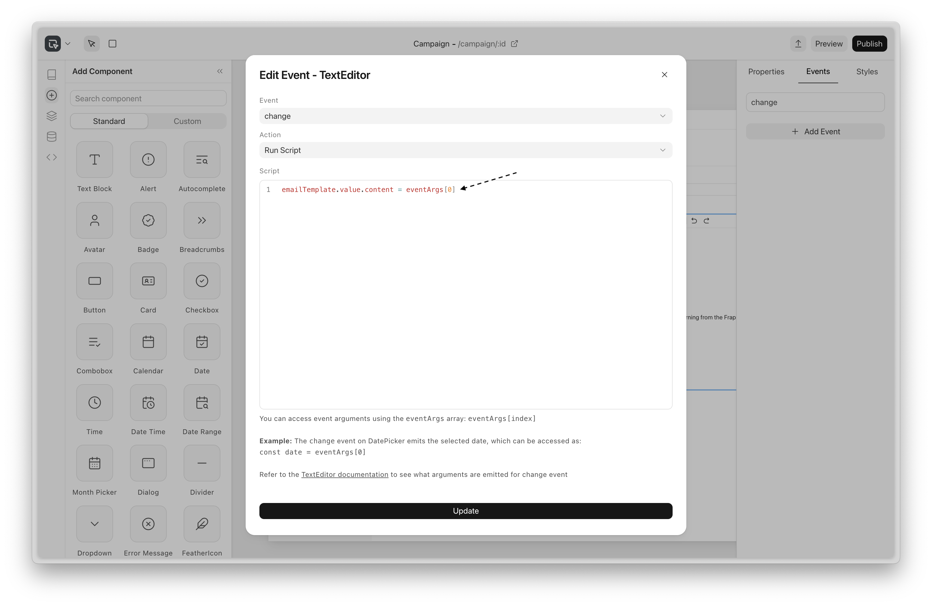
Access event arguments in scripts (#153)
Previously, there was no way to access the event arguments passed when the event occurred
It’s now available with the eventArgs array
Examples:
For a “click” event, you can access the MouseEvent object as
const mouseEvent = eventArgs[0]
The “change” event on DatePicker emits the selected date, which can be accessed as:
const date = eventArgs[0]
Miscellaneous
- Fix: Component’s local context (repeater data) was not available in the scope of the function props
- Fix: Dropdown not rendering in app

.png)
The new Writer is developing very well, with a suite of new features and improvements. You’ll notice that the UI is much more aesthetic and accessible, and a lot of long-pending bugs have been fixed.
Tabs
You can now use sub-documents within a document! This allows clean separation of concerns.
Templates
Have a commonly used page? Go over to Settings and add it as a template:
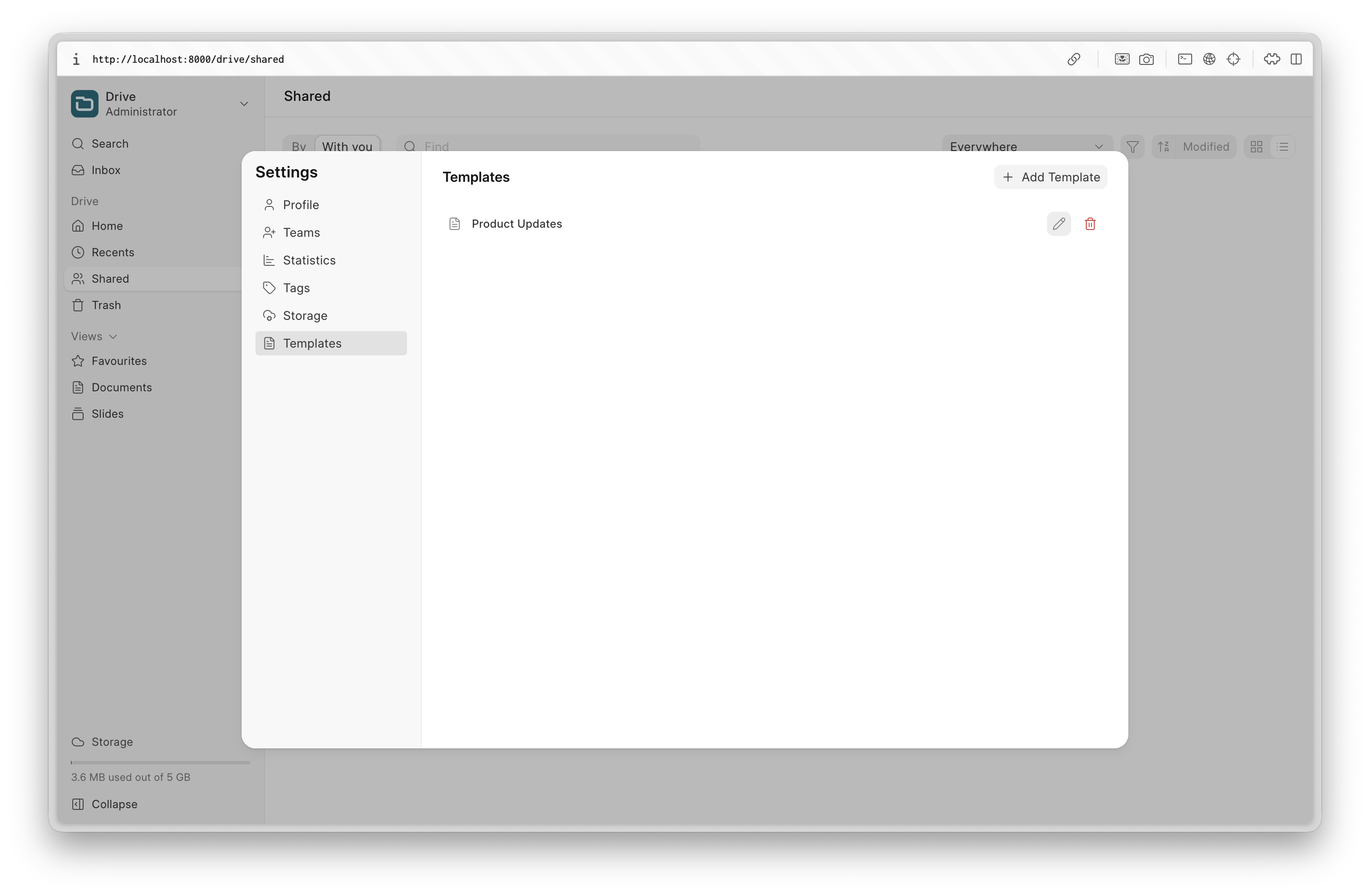
You can then easily use it in Writer:
Global Search
Search through your documents quickly, making it easier than ever to find the documents you need.
There are dozens of tiny features added that will make your writing experience better. A few selected ones:
- Redone table editing experience, giving you control over the minute details of the UI.
- A table of contents component in the editor
- Line height/paragraph spacing
- Page breaks
- “Paint styles”
- Clear formatting
- Thumbnail view
Apart from these, lots of the underlying architecture was redone, making Writer a much more secure and stable app. We’re looking forward to launching Frappe Writer before Build.

The focus of this month was to make the editing experience more reliable and to improve slideshow media loading times, along with other improvements to the editor.
Offline Editing & Auto-Sync (#139)
You no longer have to worry about losing edits when your connection drops. Changes are saved locally first, and a small badge in the top right shows when you’re working offline. Once you’re back online, your latest edits sync automatically to the server.
Under the hood, this works by saving the latest presentation state in IndexedDB, using a map keyed by presentation IDs. It’s an offline-first approach, so offline updates are stored locally as “dirty” changes and pushed to the server automatically when connectivity returns.
Media Caching for a better Slideshow Experience (#139)
Now, we use a minimal service worker setup for basic media caching, so media doesn’t have to be downloaded again once it’s been loaded. During Slideshows, media loads significantly faster thanks to a combination of pre-fetching media while you’re on the previous slide and caching via the service worker for quicker access.
Quickly Adding Text & Slide UX Enhancements (#140)
Double-clicking on a slide now adds a new text element at that spot so you can start editing instantly. Adding a blank slide is also quicker now by just pressing Enter, or you can use Ctrl + N if you want to choose a layout.
Input Control Improvements (#134)
Color Picker
You can now copy a selected color from the picker and paste it to style other elements. We also fixed a bug where the color picker would switch between RGB and HEX. Now, it consistently displays values in HEX.
Slider Input Control
Previously, interacting with the slider input was a little tricky due to there being a very small amount of space that triggered changes for the slider to work correctly. Now, the effective area of the slider gives a little bit more margin for the user to interact with it.
Other Fixes
- Reduced unnecessary save calls caused by incorrect dirty state handling - #143
- Fixed an issue that made newly added elements briefly render in an intermediate position, which caused unexpected behaviour when undoing the addition - #140
- Resolved an issue where attachments were lost when deleting the source of a copied presentation - #141
- Fixed pasting behaviour to support copied images from sources like Google Slides - #131
Fixed an issue where the placeholder didn't show up correctly for the image layout slide - #138
 Gursheen Kaur Anand Engineer
And that's it 👋
That was all for this month! We hope you found these updates useful. As always, we look forward to your feedback and contributions. Stay tuned for more updates next month!


·
Good Work there, as always ! I am really happy to see the software evolve. I am in the process of transitioning from legacy systems to ERPNext. Can't thank you guys enough.