Screenshot 2023-10-25 at 10.48.41 PM.png
Cleaning up the User Interface
Most users find ERPNext "overwhelming". A small effort to fix it.
image7f7d4e.png

By

Rushabh Mehta

·

Nov, 8 2013

·

2

min read

Few weeks back, I had sent a mail via the system to all active and trial users about what they did not like about the system. Most of the new users found ERPNext overwhelming. They found the forms too confusing and that was a big discouragement for them going forward. This needed fixing.

Few of months ago, Apple released their newest upgrade to their popular phone operating system, iOS7 and they decided to go in for a pared down, minimalist view, with shocking colours. The upgrade came in for mixed reviews and most users were critical of the updates. My personal view was also of initial rejection. But slowly I came around, one day, I finally "got" it. The new user interface felt a lot lighter and had minimum cognitive overload.

Now, many of you would not be wrong of accusing us of falling prey to the latest design fads, but this one just felt right. So I spent a week hacking the bootstrap CSS and some layout elements. I also cleaned up some of the main forms and here are the results.

The Old Form

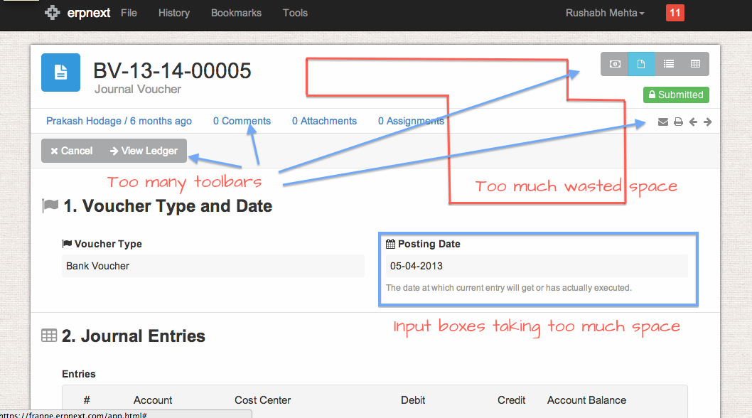
The old form had a bunch of problems. There was too much of "non-core" content on the page, too many toolbars, buttons, etc and the content often got buried - giving rise to the "overwhelming" feeling.


The New Form

We stripped out many elements that we thought were not necessary, arranged fields in a slightly different manner, removed bad field descriptions and here is the result.


The best part is that the "core" content is now in picture. I think this should be a great update for usability - so we just went ahead and released it.

Happy to get your comments.

Published by

Rushabh Mehta

on

Nov, 8 2013
10

Share

Add your comment

Success!

Error

Comments

Rushabh Mehta

· 

November 24, 2013

Mr Singh, thank you for your kind comments and wishes and we are lucky to have great users like your

s
sunil kumar singh

· 

November 23, 2013

really very interesting.i am feeling that erpnext is faster than earlier. can you add feature of edi

T
Tasbir Hossain

· 

November 17, 2013

Dear Rushabh :-|. Yep(really a spin) . Sometimes predictive texts are really suicidal. Any way i hop

Rushabh

· 

November 16, 2013

Thanks Tasbir. The biggest benefit is that the core data is now more visible. By the way, your spell

T
Tasbir Hossain

· 

November 16, 2013

Awesome. The new UI got a slick makeover and it feels very comfortable to my eyes as well. with the

Rushabh Mehta

· 

November 11, 2013

Thanks Shameem,

Holger, timestamp has moved to the icons on the right side. Also the the

H
Holger Winkelmann

· 

November 9, 2013

What I'm missing a bit is the status line telling you about last change, assignment and attachmen

S
Shameem

· 

November 9, 2013

Gone through Invoice and Quotation form , seems easy attractive than earlier. Thanks for the rele

Rushabh Mehta

· 

November 9, 2013

Thanks. This will be released by next week for sure. This is a big release and we want to make su

H
Holger

· 

November 9, 2013

Nice to see the cleanup, but how can we see it in our hosted instance?

BTW: One thing I r

Discussion

image7f7d4e.png

Paul Mugambi

·

3 days

ago

Beautiful read, and an insight into an individual I respect and have learned a lot from. Am inspired to trust the process and never give up.

image4c43d6.png

Anna Dane

·

5 days

ago

I must say this is a really amazing post, and for some of my friends who provide Best British Assignment Help, I must recommend this post to them.

Add your comment

Comment