Introduction
For many years, products at Frappe were built by engineers only. Like most engineer led projects, the Bootstrap project has had a major influence in the way Frappe application looked. Bootstrap was the first design system that we adopted way back in 2011/12 when it was launched. The early implementations were very much a mashup of the Bootstrap components and very little theming.
In 2015, we undertook the first major redesign for Frappe with Studio March. March helped us build a unique design language and aesthetic for the Frappe Framework and ERPNext. In 2013, Apple had released iOS 7, which completely changed the then prevailing design aesthetic from skeuomorphic (based on realism) to minimal (based on clean separation). Keeping with the trend, the 2015 design was clean, minimal, monochrome and classic. While some people complained of contrast issues, the overwhelming feedback was that it looked great, and it looked very original. We chose to work with the best designers we knew, and in hindsight I can say it was the best investment we made at Frappe.
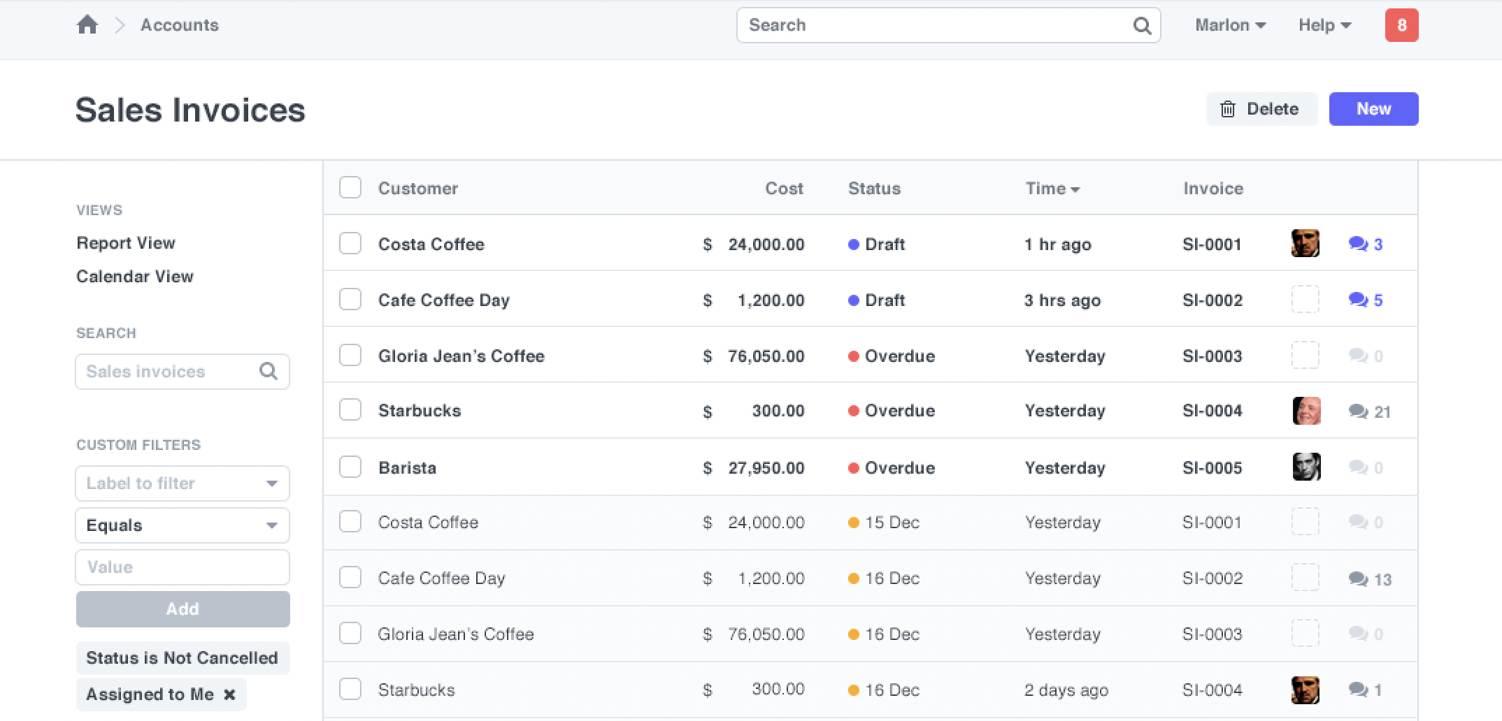
Frappe Design 2015 by Studio March
A lot has happened since 2015, when ERPNext was still a fledgling project. Five years is a good time to give the design and branding a refresh. During this time, there has been a general trend of adding more vibrant colours and shades to design. The 2015 Frappe look felt old and faded. We knew it was time to refresh and keep with the times. A redesign is also an opportunity to remind the users how the product has moved on and modernized.
Finding the right partner
When we went back to Studio March, they were no longer working on client projects. They had just started their ambitious MarchTee project and wanted to dedicate all their energies there. Our next collaboration with a Delhi based firm turned out to be disastrous. We were so put off by that experience that we decided to hire an expensive designer to help us with our ongoing design work. That did not work out well either for various reasons and we were back to square one. One day, in August 2019, while I was furiously browsing on Dribbble for designers in India, I bumped across artwork by Udhaya Chandra of Timeless and immediately dropped them a mail via their website requesting them to work on a new accounting app we were planning to build. Luckily the stars aligned and we started work on Frappe Books.
Frappe Books
Frappe Books is an experimental project we were working on. People always complained that ERPNext was hard to install and small businesses needed something they could easily download and install on their machines. Over early 2019, Faris and I worked on a brand new framework and app based on Electron, the desktop platform based on the Chromium browser to build desktop apps. Simply called “Accounting”, this app had limited features, double entry accounting, billing, ledgers. This seemed to be a small yet complete project to start rebranding our design.
Over the next few months, Faris worked with Sandeep from Timeless and they built a really slick UI for the app. It looked fresh, contemporary and well-designed. We did not have any “framework” constraints and we let the Timeless team explore both newer styles of layout and aesthetic. Some interesting implementations include the three column editing for master objects and the really cool invoice designer.
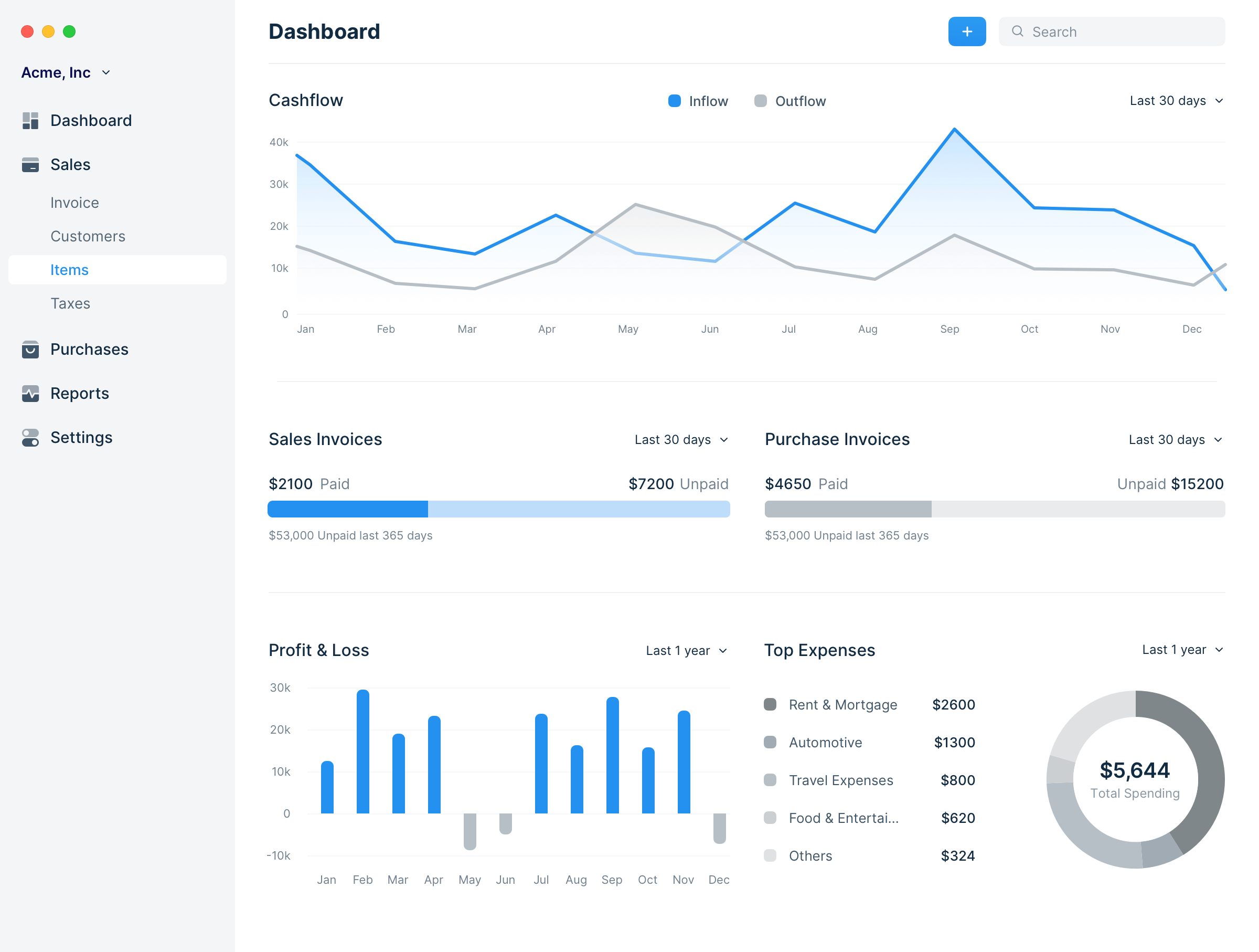
Frappe Books Dashboard
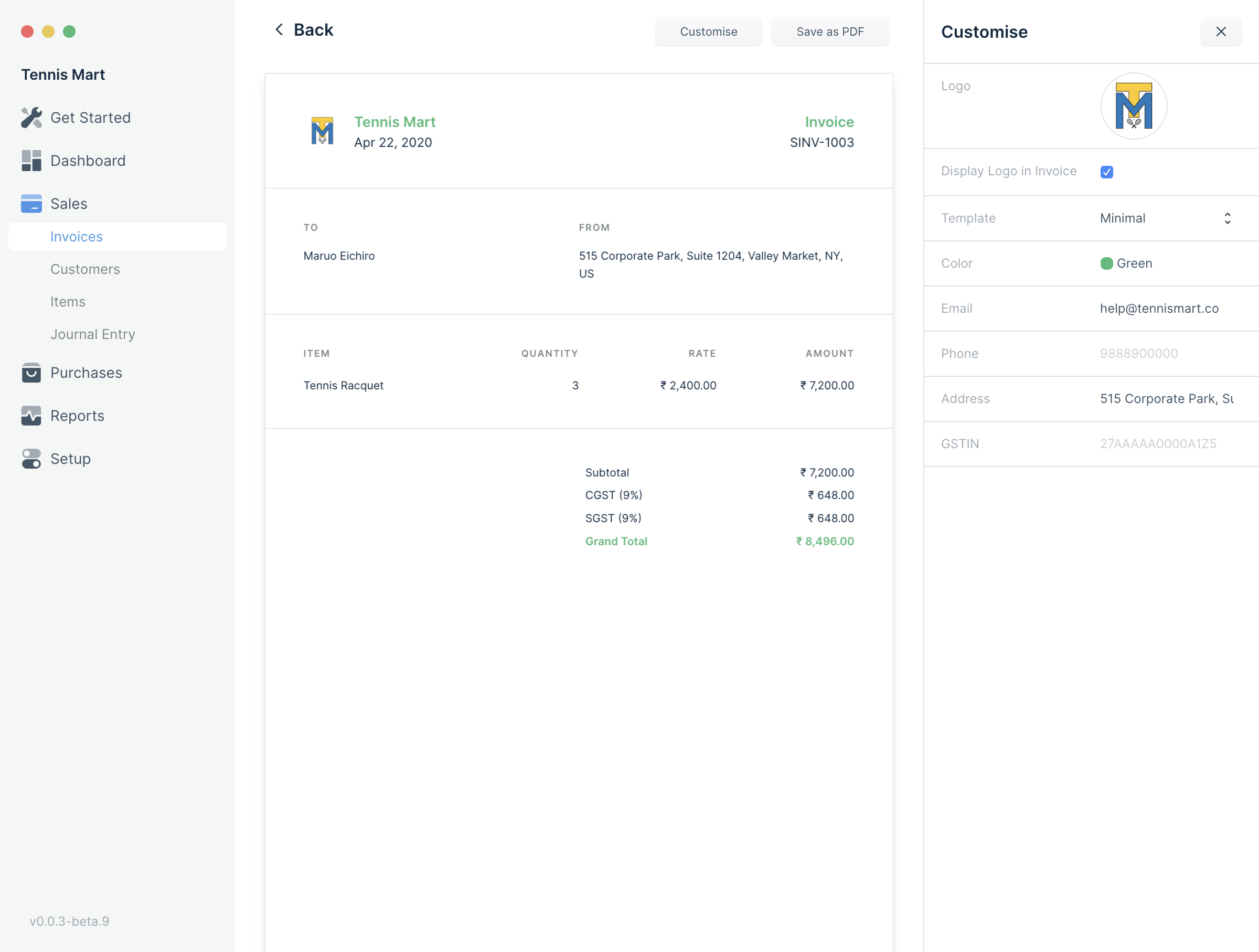
Invoice Print 3 column layout
Branding
Frappe Books looked like nothing Frappe had ever built before. Now we had to build the website and branding for this. For this we started from first principles. Our thesis was that print designs are classic, and as web matured, it would move towards print style layouts. We did a survey of the trends and styles. Some brands are very “design heavy” and their websites end up looking like art galleries, diverting attention from the core message. Few brands got the balance between design and communication right.
For Frappe, the goal was to project a contemporary brand that was both minimal and aesthetic. The purpose of aesthetics in design is like that of spices in meals. You could have a dish without spices, but their presence creates a distinct flavour that triggers an emotion and leaves a memorable impact. But spices should not overwhelm and destroy the texture of the core energy and nutrition part of the meal. With this in mind we started exploring options for branding.
After trying out a lot of different options, we decided that the aesthetics of the inward looking “app” and the outward looking “website” should be the same. The only thing left was the branding elements. What kind of objects do we use and how do we express them? These objects had to be distinct and re-usable that would form the core identity of the brand.
Tintin has been a childhood favorite for me (and I assume for you too!). The artwork by Georges Remi and team is the gold standard for comics. Vibrant colours, expressions, details, technically correct, topical, international, forests, deserts, oceans, the artwork of Tintin is world in itself. As a young kid, I used to copy the cartoons and even try and write my class notes in the same style as the comic books. We started to explore the idea of can we use this style and bring it to the modern age? Udhaya immediately liked the idea, and thus we found our branding.
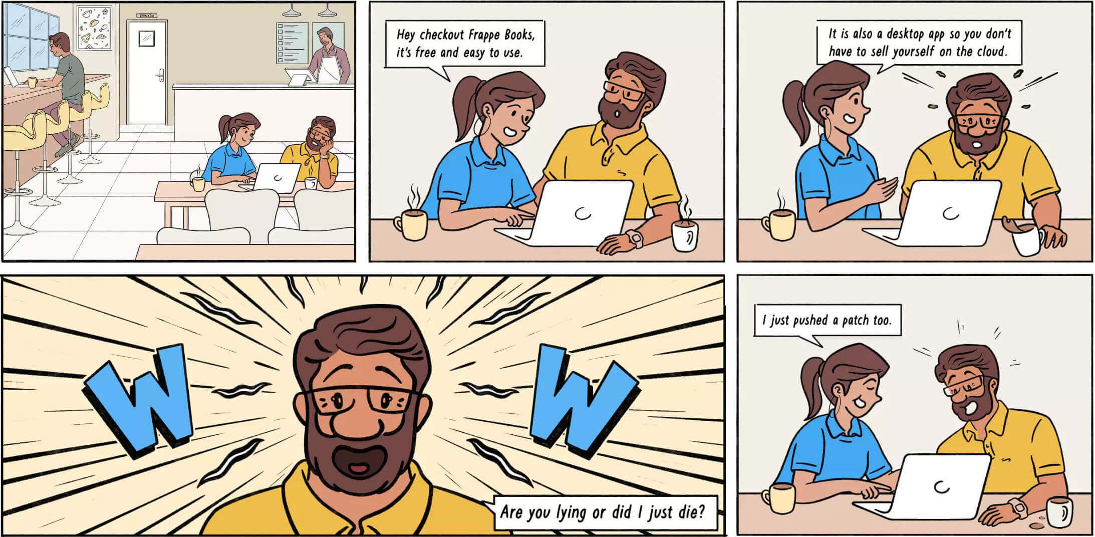
Frappe Comics
Once the website was designed and executed, and on 6th May 2020, we posted it on Hacker News and Product Hunt, and hit the front page of both these popular destinations. A job well done!
Website Builder
I have been implementing the core websites of Frappe and ERPNext for quite sometime now. After trying to solve the problem of layouts again and again, I was sure there was a better way to do this. Faris was doing a fantastic job in executing the website design of Frappe Books, and one afternoon at our Mumbai office we had a really hot debate on this topic. Faris and the rest of the UI team was of the opinion that websites must be “crafted” and did not agree with my view of a standardized layout system. There was no way I could explain to them the pain I have gone through the years doing this job again and again. That left me with only one option, to build the page builder myself.
So I started reimplementing the website in a page builder with standard blocks like sections, cards, hero sections etc. This was enough motivation for Faris to come in and say, “Hold on, there's a better way to do this”. As a habit, I have always taken the liberty of merging my own code in the Framework without much oversight, so I went ahead and merged this page builder. After Faris built his better (I still have some doubts on the JSON data objects) web page builder, Suraj went ahead and removed my contribution. That was a shocking moment for me. While I was annoyed that my contribution was removed, I was also proud that the team was empowered enough to overrule me!
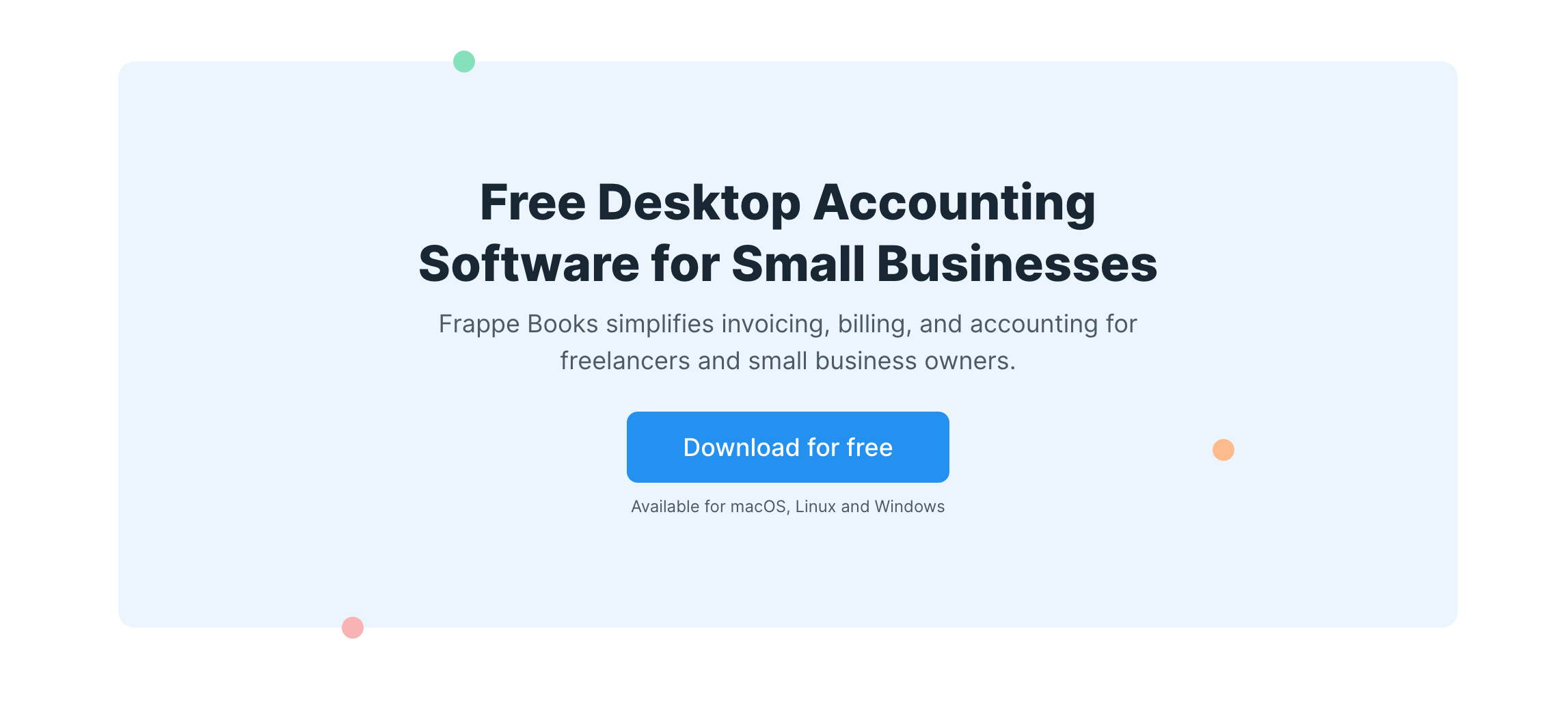
A Standard Component in the Web Page Builder
Redesigning Frappe Framework
Now that we had worked on all the aspects of design, from application to branding, it was time to take it to the wider Frappe ecosystem, starting with Frappe Framework. Frappe Framework is the heart of the application layer for ERPNext. Frappe provides most of the standard views that are seen in ERPNext. From May onwards we started working on a marathon project to redesign both ERPNext and Frappe along with Timeless. With Frappe Books, we had our vision and branding in place. Now the challenge was to scale 10X in complexity and execution.
Design System
Frappe Framework (FF) has dozens of components, from buttons, inputs to alerts and badges. The first step was to take all the components from the Frappe Books application design and put them in a design system. These would then be the building blocks of all the different views inside Frappe Framework.
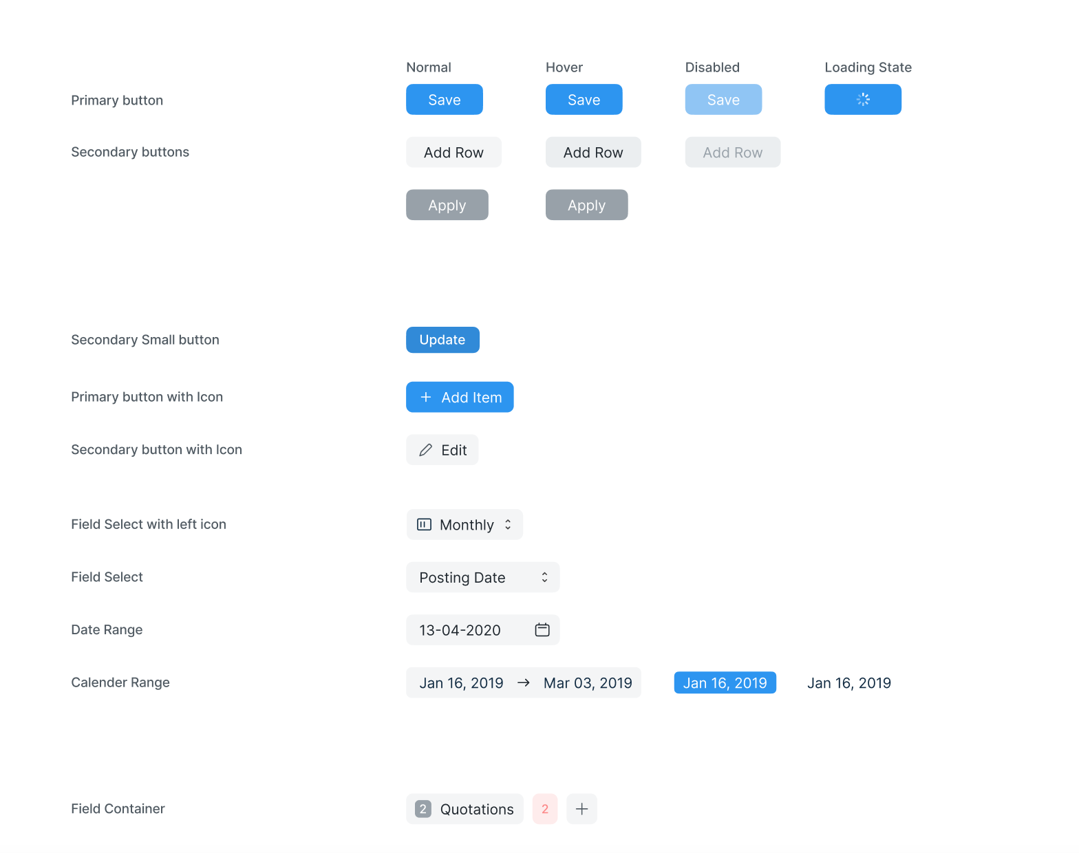
Frappe Design Components
The information hierarchy in FF is that a unit of information is called a Document and documents are grouped by their types, called DocTypes, which are then grouped into Modules. Each of these entities has multiple standard views. DocTypes can be represented in a list, a spreadsheet like grid, a tree, a calendar or a kanban board. Individual documents have an editable form view, a print view and possibly a web view. So three core entity classes (records, collections and modules) and their multiple views.
There are a lot of standard operations like workflows, assignments, permissions that also need to be incorporated into the design. While the Timeless team started to build the components, the Frappe team started to implement them. As the implementation progressed, we found more and more situations, like empty states, and fully activated states that needed different design treatment. Some of the components like the document “timeline” were completely redesigned.
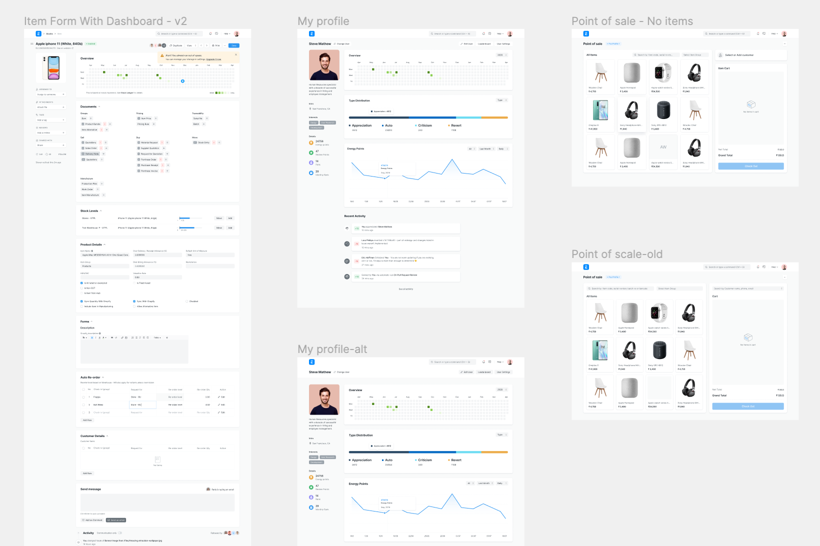
Frappe Standard Views
Rebrand or Refactor?
One of the key challenges faced by the team was how much to refactor code while we rebranded the components? One proposal was to scrap the complete UI and rewrite it fresh in a modern UI framework like VueJS. Ultimately we broke down the challenges into 2 parts. The implementation of style and the implementation of interactions. We decided it would be too much of a risk to rework both these implementations, so we focussed on re-implementing the style. Bootstrap had itself moved from LESS to SCSS as its style pre-processor. Also utility classes were gaining a lot of traction in the design community, so there was also a push to implement both semantic and utility classes in the new design.
Polishing, Polishing, Polishing
After five months of dedicated effort by Suraj, Prssanna and Shivam, along with Sandeep and Jaya Prakash from Timeless, it seemed we were ready to go live. The website for Frappe and ERPNext was already done by Faris, using the (you guessed it!) web page builder. The first thing was to start using it internally at Frappe. So in December 2020, we decided that the redesign was good enough to start using internally and get feedback. After throwing it open to real users for the first time, the feedback started pouring in So much so that team had to create a new issue tracker for it. Most people loved the new look. People belonging to a certain age group were already more comfortable in the “dark mode”. Within 2 months, close to a 100 issues were reported and we started the job of polishing the UI.
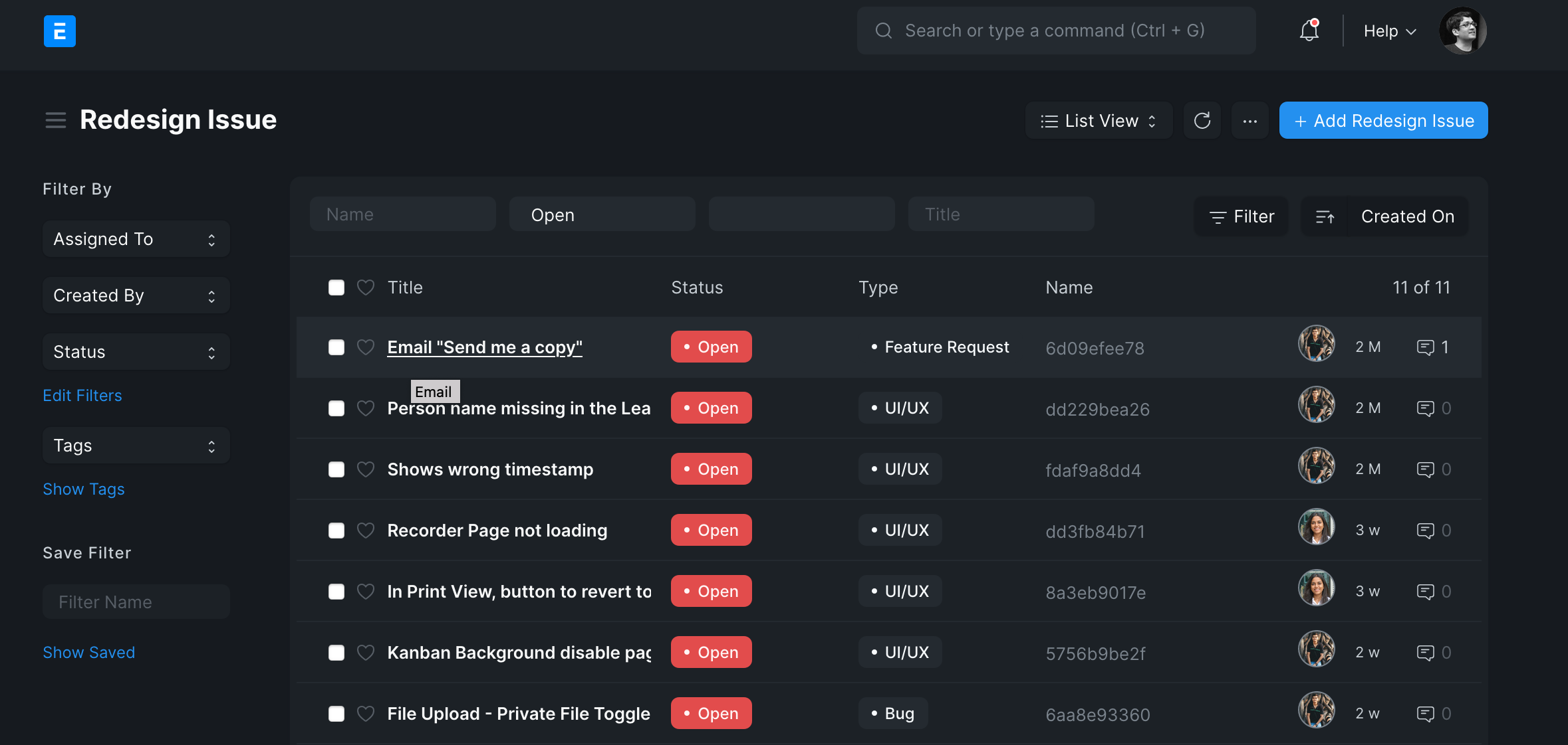
Redesign Issues, in dark mode
Great design like Dieter Rams says is useful, aesthetic, innovative and “thorough to the last detail”. This is where I think the team has a fantastic job of getting the job done. In 2015, we made a great leap forward, and this is 10 times that. This has been the culmination of an 18 month marathon and terrific collaboration between Timeless and Frappe teams. Personally, it brings me great joy and satisfaction every time I reflect on this journey, though I had a small part to play in the execution.
On the other hand, this is just the foundation. Our goal was to modernize the existing interface and bring all our assets to a common level. From this foundation we hope to look at all the major interactions and not only refine at the “user interface”, but also the “user experience”. We expect this journey to be no less a marathon and no less thrilling.


·
Great post!
·
Thank you for great insight.